Car buying service redesign
Rebuilding the Locate a Dealer experience around member pricing
Key results
After implementation, the page saw a 66.43% increase in referrals over the previous 3-month average.
The challenge
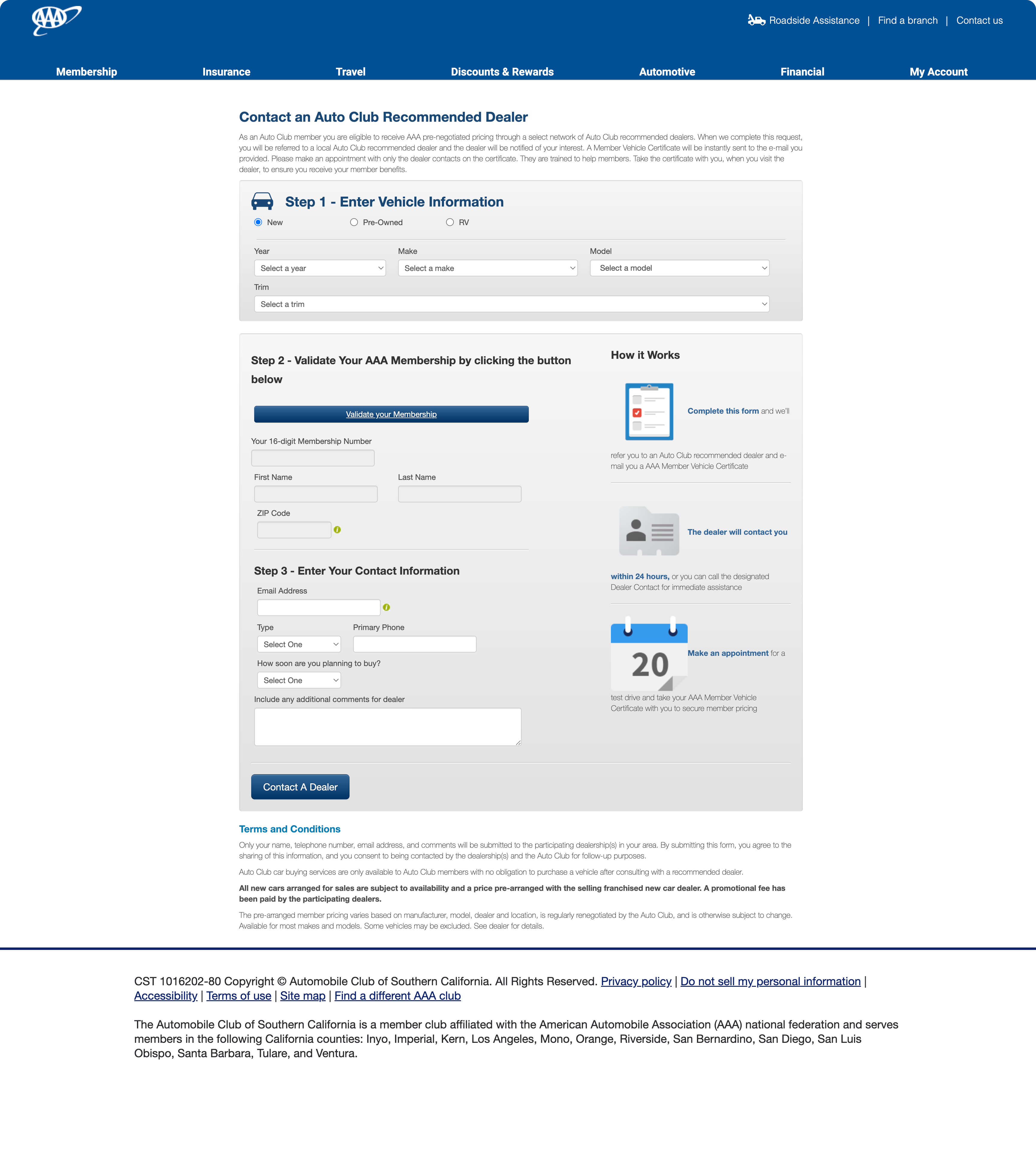
The dealer referral form was structured around the system's needs, not the member's. Three numbered steps front-loaded vehicle selection before explaining what the member would get. Membership validation sat in the middle of the flow as a hard gate. Dense terms and conditions ran below the form with no answers to the questions members actually had.
The solution
Rebuilt the page around the member's decision, not the form's sequence.
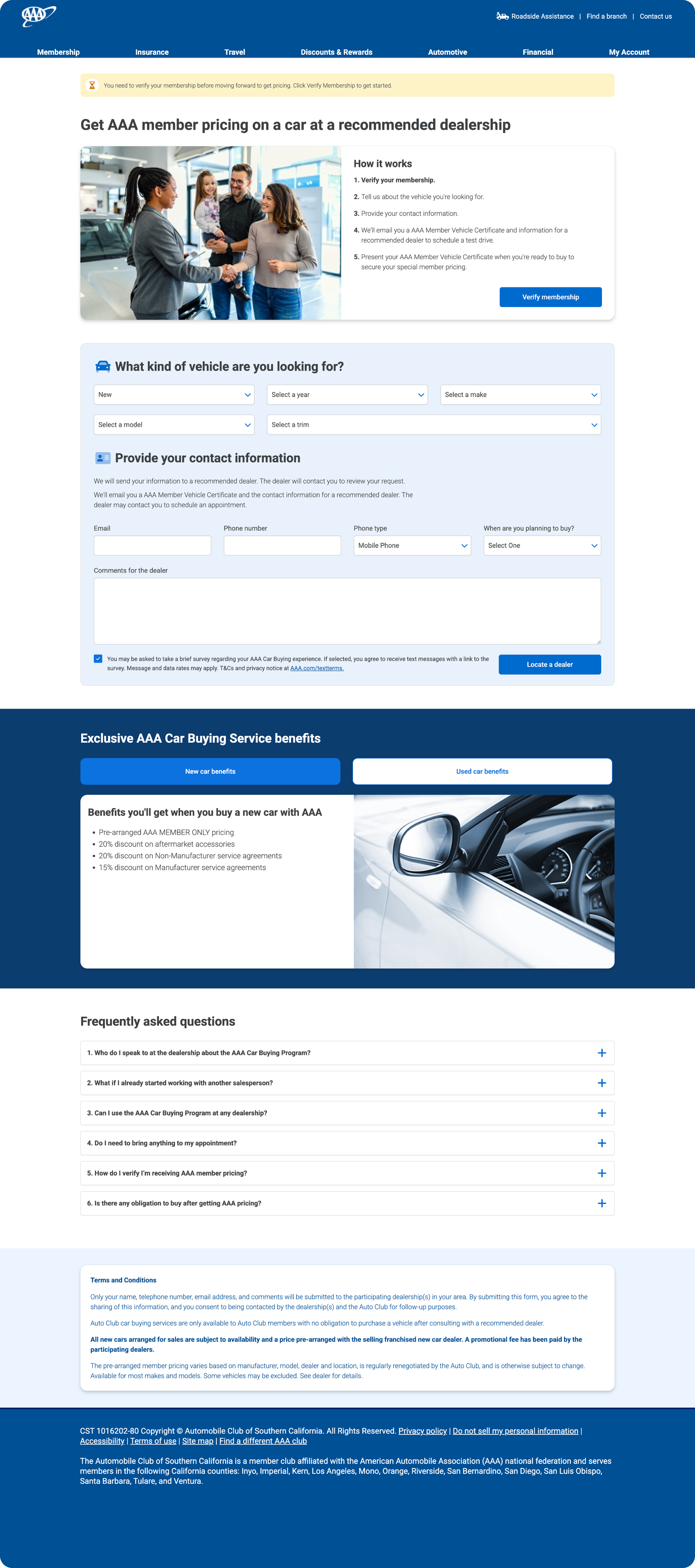
The headline was rewritten to lead with the benefit: member pricing at a recommended dealership. "How it works" moved up beside a supporting image and expanded into a plain-language five-step summary.
The rigid Step 1/2/3 structure was replaced with two clearly labeled sections: vehicle details and contact information. Membership verification became a persistent inline banner instead of a blocking wall mid-form.
Below the form, new content did work the original page left undone: a benefits section with tabs for new and used car purchases, and an FAQ addressing the six questions members most often asked before submitting.
Conclusion
Referrals rose 66.43% without any change to the underlying offer or dealer network. The gain came from restructuring the page around member confidence: explaining the value before asking for information, removing the mid-form gate, and answering objections on the page.