ZIP code modal redesign
Turning a trust barrier into a welcome.
Outcome
Spam complaints stopped. The modal went from a trust barrier to a branded moment, and the artwork became a recurring element across the site.
The challenge
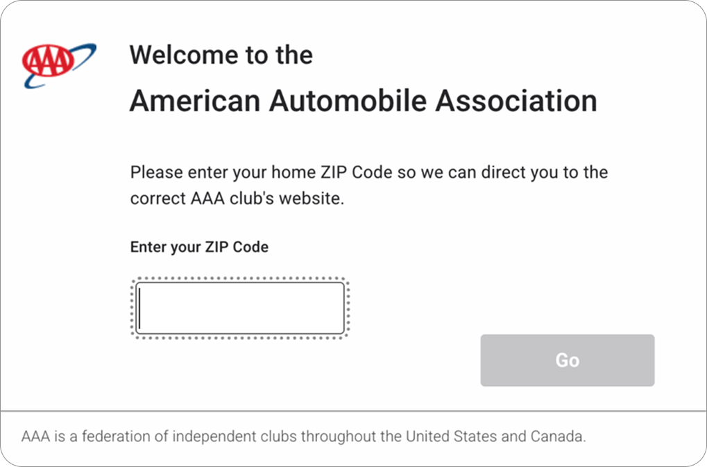
The ZIP code modal was the first thing many members encountered, and users said it felt like spam.
The reason was structural. The screen had every marker of a phishing interstitial: it appeared before any content, asked for personal information with no explanation of why, and gave no visual signal that it belonged to a real, familiar brand.
The modal existed for a legitimate reason: AAA is a federation of independent clubs, and the ZIP determines which club's site a member sees. But the design gave members no reason to trust it.
The solution
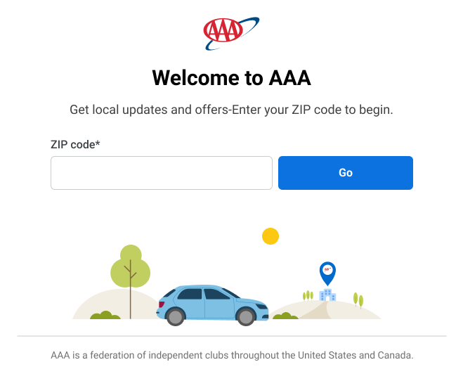
Rebuilt the modal to signal warmth and legitimacy before asking for anything.
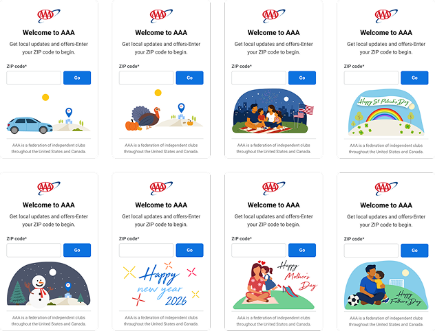
Custom illustration. Original artwork beneath the input, turning a bare form into a branded moment, the one assurance a phishing page can't fake.
Seasonal variation. A set tied to major holidays, so the screen changes through the year and reads as actively maintained.
Scaling with AI. Directed AI tooling to extend the illustration set in my established style.
Beyond the modal. Animated the artwork in Adobe Animate as HTML5 for the homepage, beside the AAA logo.
Conclusion
The complaints stopped. Nothing changed about what the modal asked for or why it existed; what changed was whether members believed it was legitimate.
Trust on a first-touch screen isn't earned through explanation alone; members decide in under a second, before reading.