My account login experience redesign
Reducing login friction and improving account access conversion.
Key results
Forgot username: 60% drop in credential-recovery clicks
Get proof of insurance: click-through nearly doubled, 0.9% to 1.7%
Login conversion: 52%, a 3% relative lift
My Account visits: up 5%
The challenge
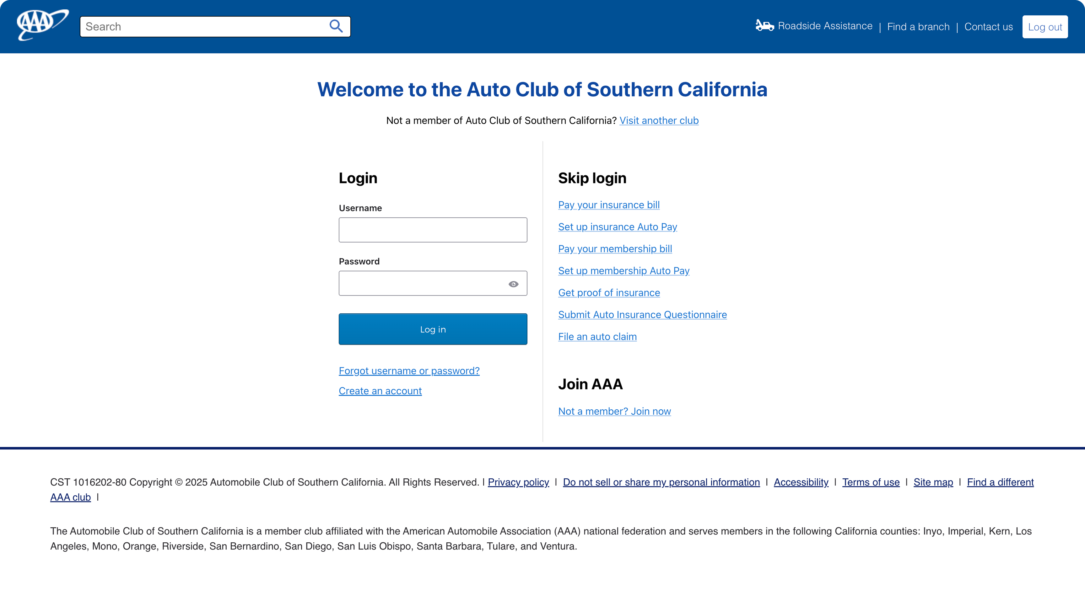
The login page was a plain form beside an undifferentiated list of "skip login" links. Members who couldn't remember their credentials had one visible escape hatch, and self-service tasks were buried in a flat link list with no grouping or hierarchy. The page also sat outside the main site navigation, dead-ending anyone who arrived by mistake.
The solution
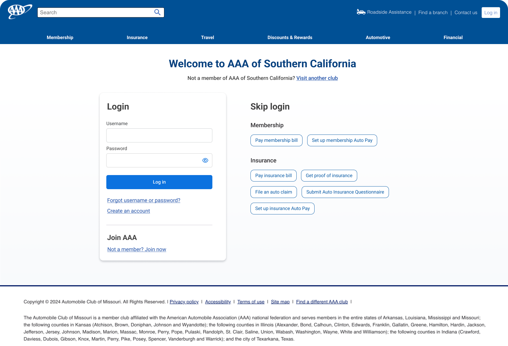
Rebuilt the page around two clear paths: log in, or complete a task without logging in.
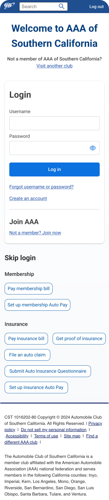
Login moved into a contained card with clear focus. Skip-login tasks were grouped under Membership and Insurance headers and converted from text links into scannable buttons. Primary navigation was added so members could reach other parts of the site. Join AAA was folded into the login card as a tertiary path rather than a competing column.
Results
Measured across matched 135-day pre and post periods.
Login conversion rose from 50% to 52%, a 3% relative lift. Login page visits grew 2% and My Account visits grew 5%.
Forgot username click-through dropped from 11.6% to 4.6%, a 60% decline. This is the headline result, since the recovery link is a failure signal.
Get proof of insurance click-through rose from 0.9% to 1.7%, nearly doubling. This is evidence that grouping tasks by category improved discoverability for high-intent needs.
Conclusion
The redesign moved members through the front door rather than around it. Login conversion improved while credential-recovery clicks fell by more than half.
The one skip-login task that grew, proof of insurance, points to where categorization pays off: grouped and labeled buttons outperform an undifferentiated link list.